- documenta
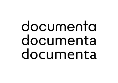
documenta and Museum Fridericianum gGmbH is pleased to introduce its new visual identity, developed in close collaboration with the design studio Our Polite Society. The new corporate design embodies openness and a process-oriented approach while continuing the legacy of documenta design history.
Seven decades after its foundation, documenta is looking to the future: In the context of its structural realignment and with increasing momentum toward documenta 16 in 2027, documenta and Museum Fridericianum gGmbH unveils an innovative new visual identity. The organization’s new corporate identity (CI) stands for openness, a process-based approach, and for advancing the design history of documenta. The new CI was developed together with the internationally active Our Polite Society design studio, which is renowned for its conceptual clarity and typographical innovations.
“We wanted a CI that visualized our openness and stance, but also provided scope for what is to come,” explains Andreas Hoffmann, Managing Director of documenta gGmbH. “The new corporate design expresses a change process and symbolizes the complex relationship of unity and variety within our organization. At its core is a holistic understanding in which strategy, culture, and visual identity interlock, thus creating a coherent brand journey for visitors. The decisive role played by the events program underscores the intention behind our wide-ranging offerings: to have an influence deep into society. At the same time, it also indicates what documenta in Kassel will stand for in the medium term. The collaboration with Our Polite Society was an intensive and inspiring process that brought us great clarity on precisely this point.”
A purpose-developed font family forms a central element of the new design; its differing variants reflect the individual institutions and at the same time unite them under the single roof of documenta und Museum Fridericianum gGmbH. The OPS documenta font draws on three influential 20th-century typologies: geometric, sans serif, and humanist. Use of the variable-font technology allows for fluid transitions and intermediate stages that are assigned to the respective individual institutions in the documenta family.
“In our concept, we reflect on both the historical context of documenta and on the typographical currents since its inception,” the team at Our Polite Society comments. “In addition to the challenge of drawing on the formal language of the various documenta institutions, we wanted to design a font system that visualizes the exciting typographical scope of the last 70 years. Just as the documenta itself repeatedly re-assigns concepts in art, we wanted to explore the aesthetic interstices within typography. This approach enabled us to resolve the contradiction between uniformity and complexity.” The new corporate identity develops successively in all the communications media used, from the website via corporate letterheads to signage.
The new website is online!
You can download images here.
Team
Concept and Design: Our Polite Society (Dodo Voelkel, Laslo Strong, Matthias Kreutzer)
Font design and production: Our Polite Society and Jan Egbers
Project management and web development: Our Polite Society
Design assistants: Christina Lehmkuhl and Sasha Kulikov
Project management: Melissa Liebeck, documenta und Museum Fridericianum gGmbH
