- documenta archiv
In a competition at the end of last year, the Stuttgart Design Agency L2M3 Kommunikationsdesign GmbH was selected to create a new, modern corporate design for the documenta archiv.
The new visual identity developed by Professor Sascha Lobe and his team encompasses not only the documenta archiv’s logo and letterhead, but also a radical new concept and design for the website www.documenta-archiv.de. Additionally the archive received a custom typeface.
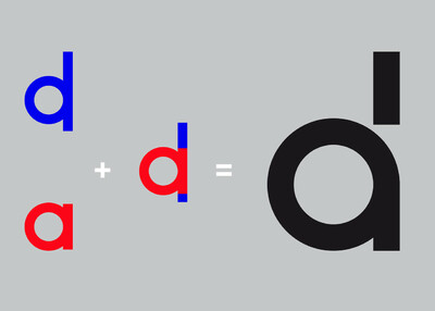
For the documenta archiv’s logo, L2M3 designed a special new character as part of the custom alphabet that can simultaneously be interpreted as the lowercase letters ›d‹ and ›a‹. The merging of the two letters into one character seizes on the visual language of earlier documenta exhibitions, which was distinguished by geometrically constructed typography. It refers to a reduction to basic geometric forms in combination with impressions of fonts from the 1950s and 1960s.
The purpose of an archive is to store large quantities of image and text sources, which are primarily stacked in boxes, folders, or drawers. This was adopted as a theme in the design by layering surfaces and images as a stack, from which the consistent design for the print media and website was derived.
The documenta archiv is pleased to introduce the new website www.documenta-archiv.de and is excited to present the ideas of the archive on the way to become an independent research institute in a better way.
